


Sports streaming app in Chile & Argentina
A live and VoD streaming app focusing on football in one of the worlds liveliest football markets.
My role: Senior designer
Team: 7 product managers, 1 designer, 1 data engineer, ? back end developers, 5 front end developers
Year: 2023 - Present

My role
I joined the team at the end of November 2021 to help with the replatforming of Estadio TNT Sports. My responsibilities included user research, concept development, stakeholder alignment, designing user flows, visual design, interaction design, prototyping, user testing, and product assurance.
Successes
Lead two teams migration from sketch to Figma
Audited the product for useability and accessibility
Built the Estadio TNT Sports design system fundamentals & component library
Launched Estadio TNT Sports in Chile & Argentina
Refined design & handover process with product, business and tech stakeholders post launch geared towards continual improvement
Made user research and user experience testing a part of the design process
Implemented design tokens
Design System
Estadio TNT Sports was being migrated from one tech stack to another as fast as designers could recreate the existing apps pages. This had lead to a large unorganised library of visually inconsistent components, colours, and type scales. When I was brought on the other designers were finishing up the last few pages I started prepping to move from Sketch to Figma. I branched and audited the Sketch libraries and began building a source of truth for the apps styling, broken into two major parts. Desktop and mobile experience (DMX), and connected TVs (CTV).

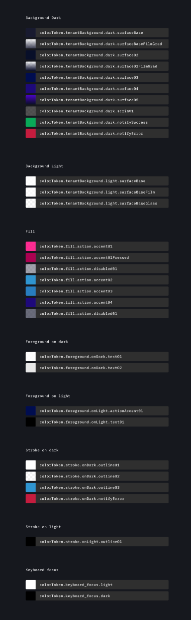
Colour tokens
Auditing Estadio’s use of colour showed me areas of quick improvements to usability. By reducing the appearance of certain colours next to each other and adjusting the hue of the blue’s and pink’s I was able to bring all colour in the app to a least AA according to Web Content Accessibility Guidelines (WCAG).
When I joined the team a lot of the styling was done in line. I worked with the engineering team to implement colour tokens across all devices.

Breakpoints
Identifying the breakpoints used in the copied version of the app showed huge gaps in catered to screen sizes leaving assumptions for devs on not only designs but behaviours.

I was able to show what breakpoints we’re currently serving. Working with the HBO Max team adapted user research for a LATAM audience and was able to recommend a new more tailored grid system.

Typography
Estadio over the years had accumulated a lot of different type sizes and style. I did an audit of the application across all platforms and listed all the uses where applicable (if they were a one off they were also included).
Here you can see the list of fonts and sizes when I started to build out a rule set for future use without and dev time to improve it. Though there was a large holding pen for miscellaneous font usage highlighting a clear area for improvement.

A new font system was then explored cutting down the total number of fonts by 20%
